Digger Trailer [A comparative case of color]
The Lab Oct 10, 2026
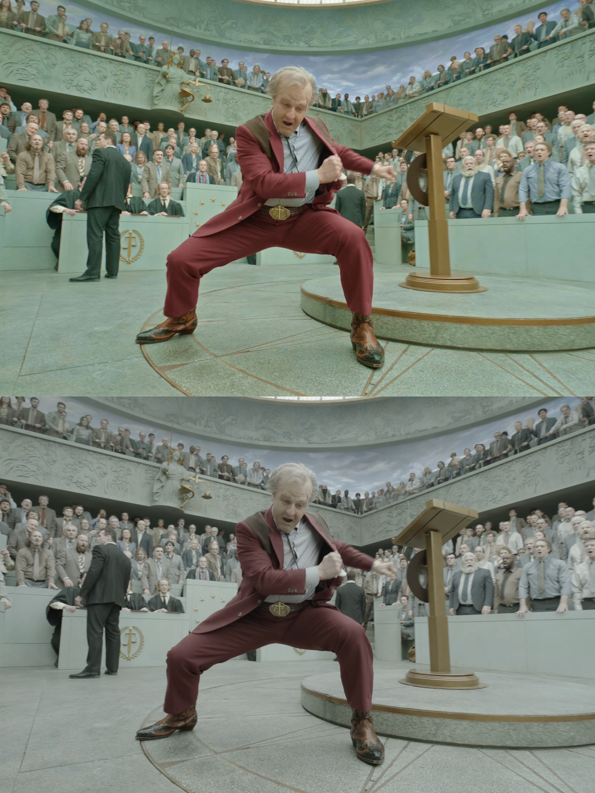
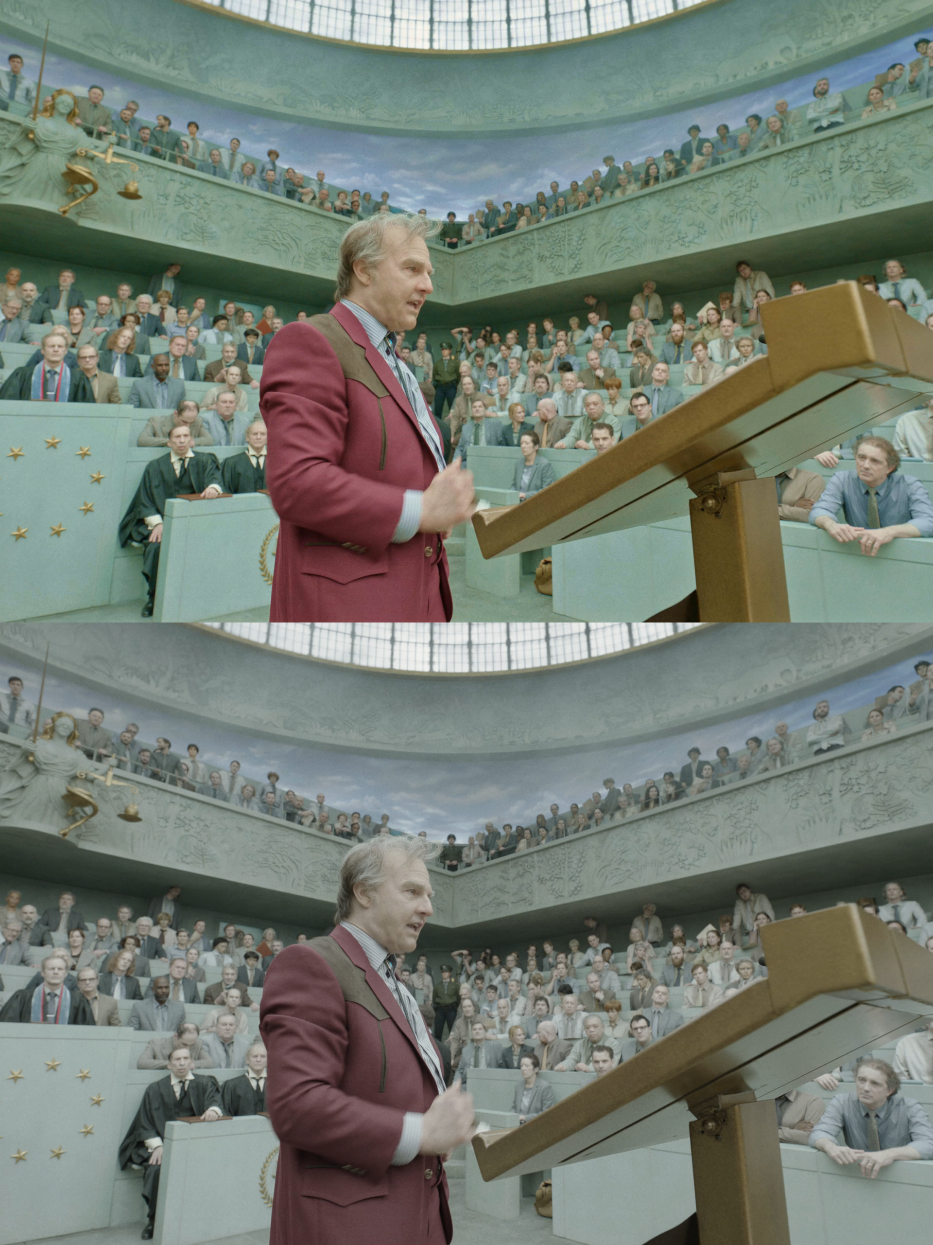
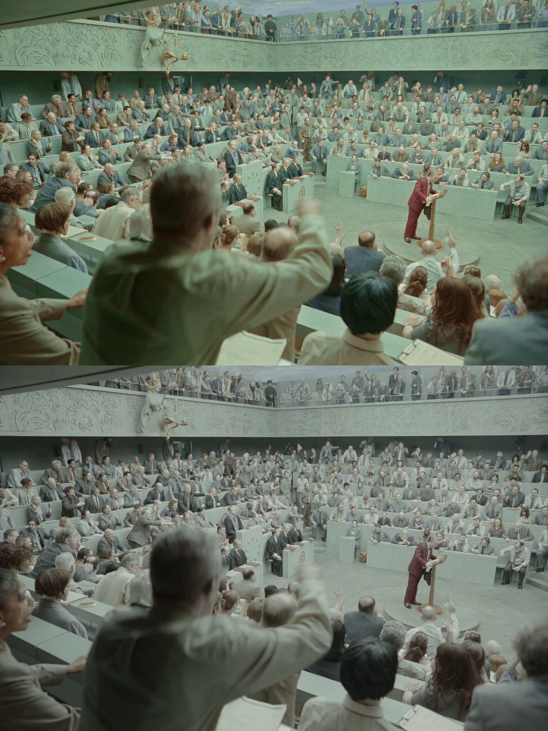
I did a very fast color grade on the trailer for Digger. I stacked up my take on a broad saturation and contrast adjustment that better suits the Vision3 film stock.
Why did I do this? Because my eye gets totally lost in the desaturated frame and the comedy is lost along with it.
Details that are color based rather than just exposure based are all processed by different neurological pathways. There is a significant differentiation between detail perceived by the parvocellular (fine detail / red – green), koniocellular (yellow – blue / eye reflex / backups), and magnocellular (contrast / motion / depth) pathways in the brain.
This is very important to me as a color blind as well as partially blind filmmaker who has learned some neurology following brain surgery. Without activation of individual pathways, the brain struggles to comprehend the specifics of the imagery. Perhaps Iñárritu’s mind works in a way that this looks absolutely perfect, but I believe most audiences were totally lost in the sauce.
I stacked the videos so you can easily pause and compare what was to what was not.
Details to look out for:
1) Being able to differentiate every character in every scene
2) Recognizing the background actors and set dec as more than just a blur of motion
3) A more compressed dynamic range where light and shadow are differentiated
4) You can make out important contextual details like John Goodman’s tie being red.
You be the judge.
Notes: I personally believe the movie should get a re-release with the colors fixed. There is historical precedent for this happening including Cats and Solo.
Disclaimer: The video was ripped off of a publicly available trailer and was made entirely for commentary and educational purposes as well as to support this movie. All rights reserved by Warner Bros. and its affiliates.